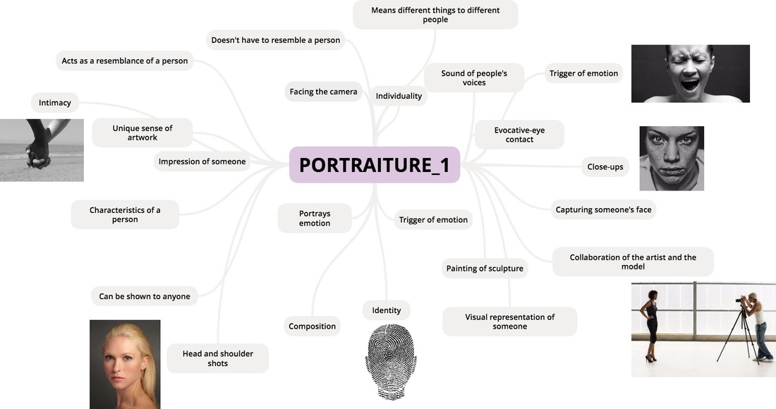
PORTRAITURE
What is a portraiture?
'The art of painting or taking portraits'
'Vivid and detailed description'
'The art of painting or taking portraits'
'Vivid and detailed description'
Myra Greene
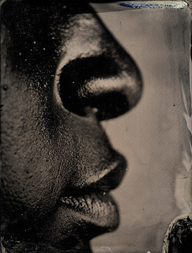
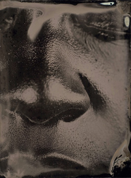
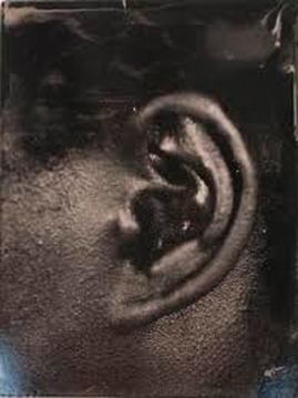
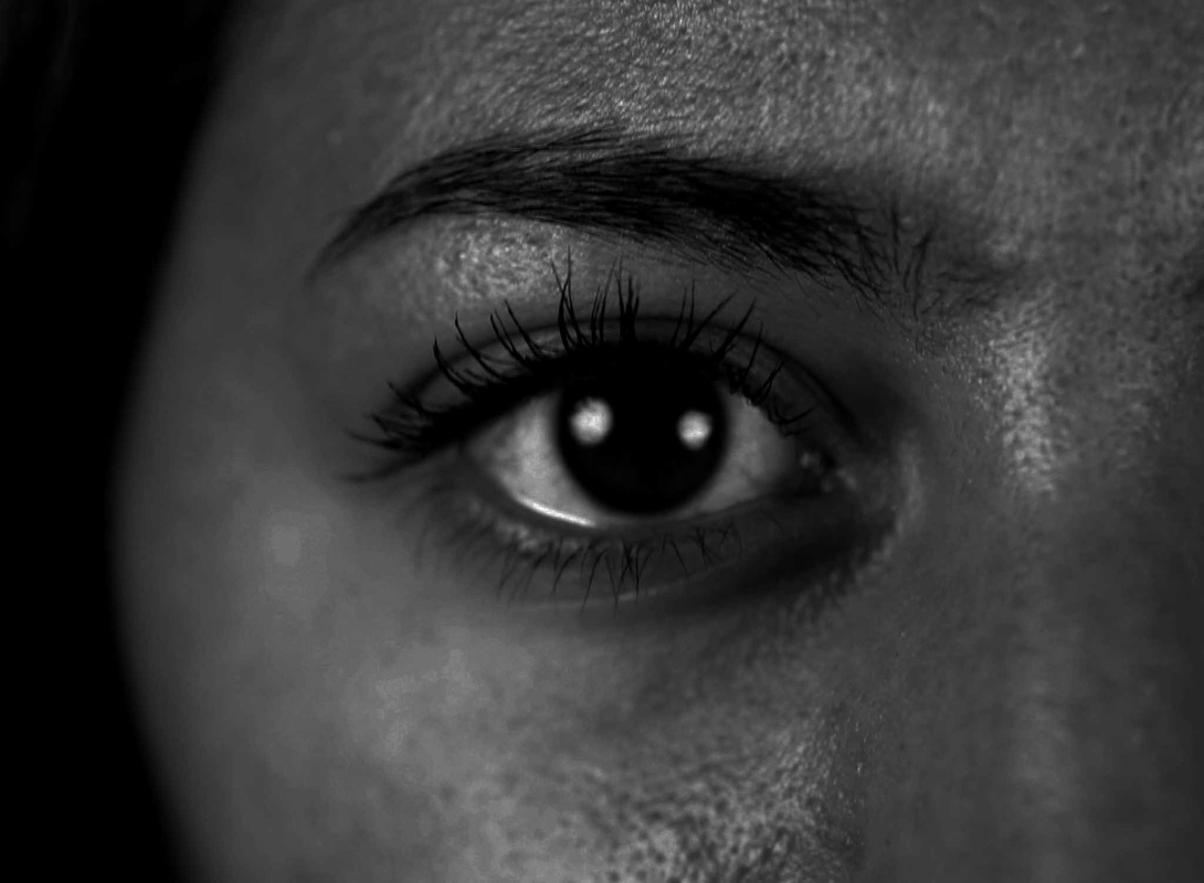
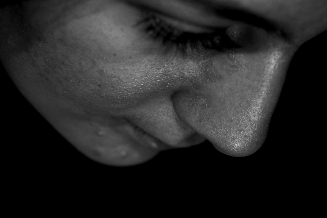
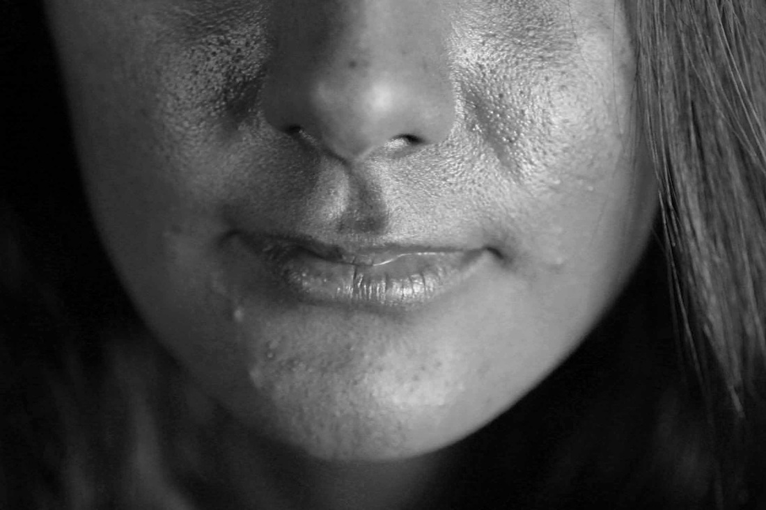
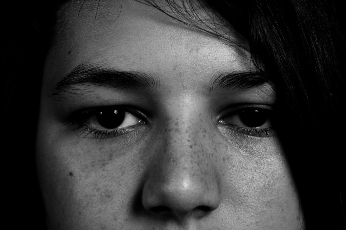
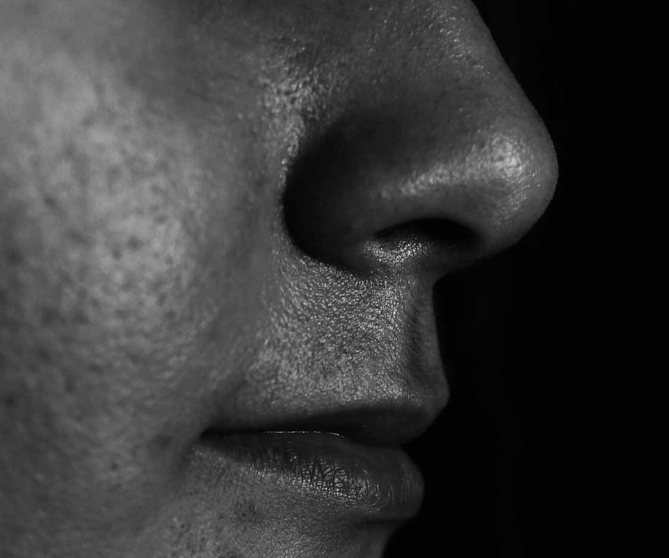
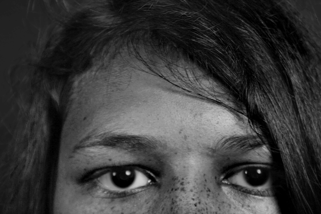
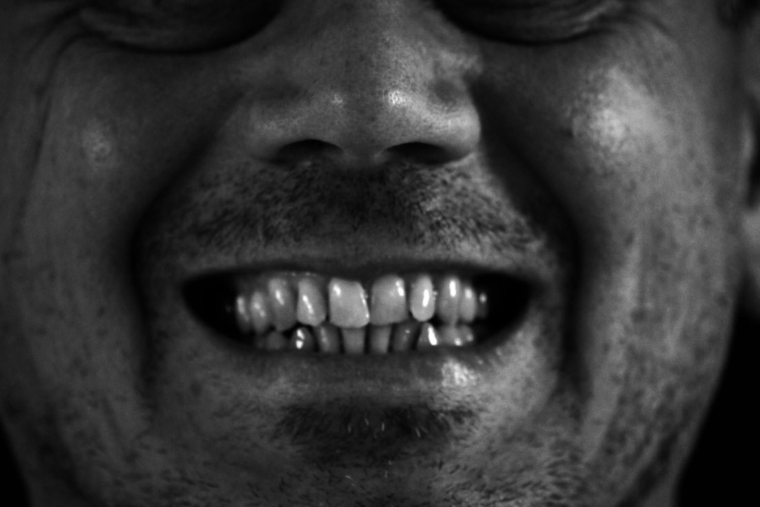
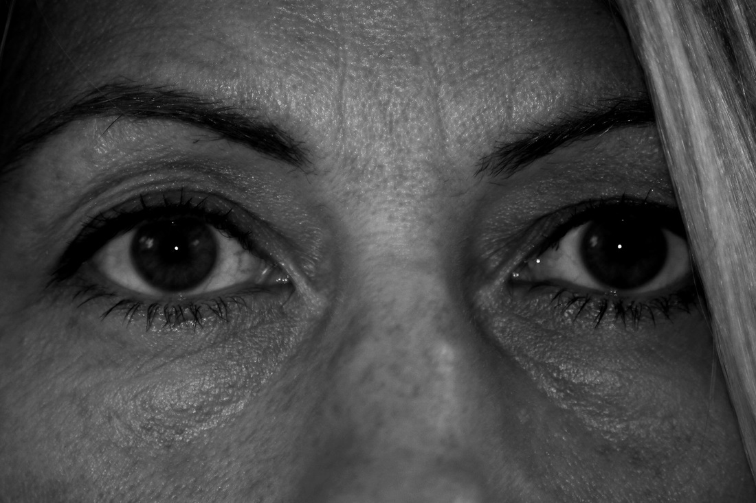
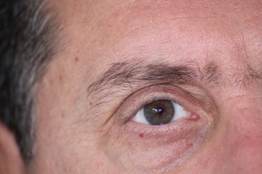
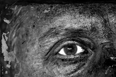
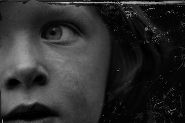
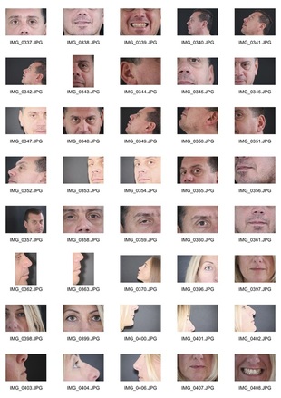
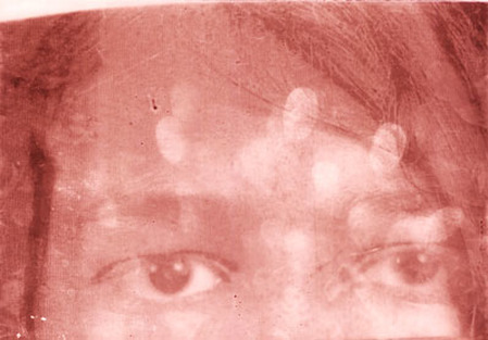
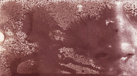
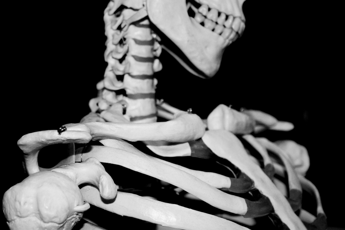
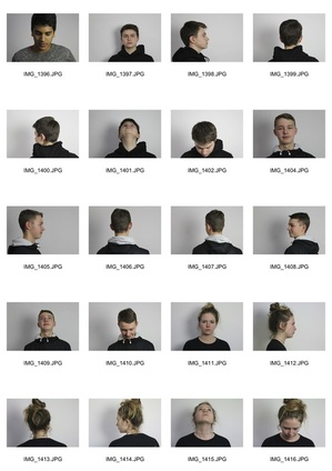
For our first task my intention was to take portraits of my peers and photograph the features of their face, e.g. eyes, mouth, nose and ears. This task was inspired by the famous photographer Myra Greene who considers ideas about race and judgement in her piece of work (linked below). This is shown by the use of close-ups and darkness. Myra Greene wanted to explore how people can be quick to judge by brief recognition of their facial features and skin colours.
|
|
|
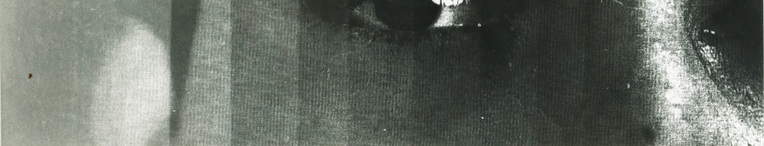
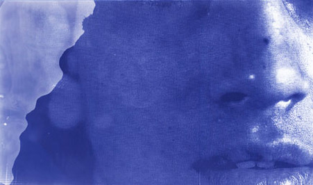
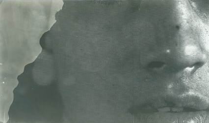
These set of images show close-ups of the photographer Myra Greene, showing her ear, nose, eye lid and lips. The photographs have an oily texture which is due to how Greene composed the photographs. The way that she created the oily effect was by setting her ISO on the lowest setting, this way it allows more light to enter the camera. Furthermore, she explains that she copies the photograph onto glass and then dips it into photographic chemicals, which results the final photographs. In addition, the context for these photographs include slavery, Hurricane Katrina, Physiology and Phrenology, for example defining a character by how they look, an idea of judgement being placed without knowing the person. Lastly, the context of her images represents photography as being a science, for example in the 1850s and 1860s, policemen used to look at photographs of criminals and looked for a common feature (for example a small forehead) and they would know that all criminals had small foreheads, (however, these days we know this is not reliable). Furthermore, her photos would represent all the racists comments in response of articles in the New York Times.
(My response /Edited photographs)

|
|
|
|
|
|
|

|
raw images
|
|
|
ARTIST AND ME
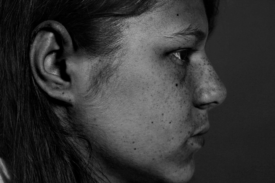
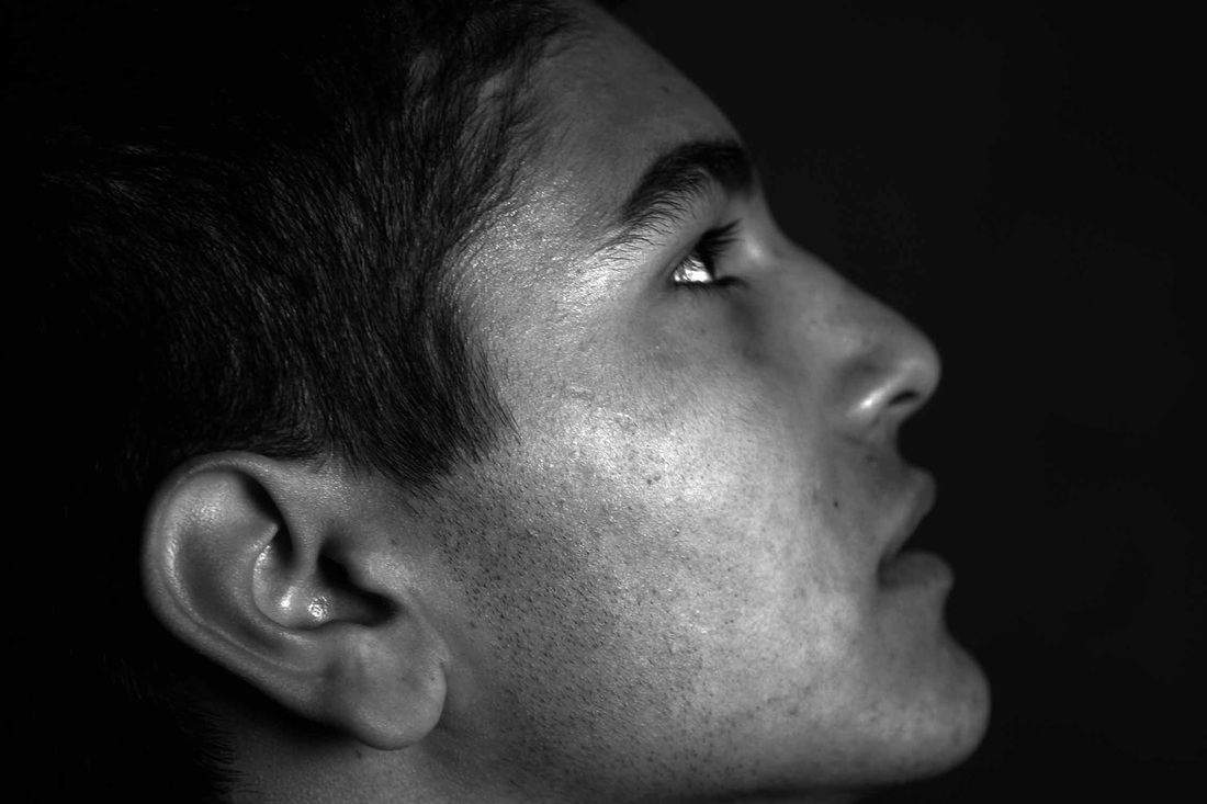
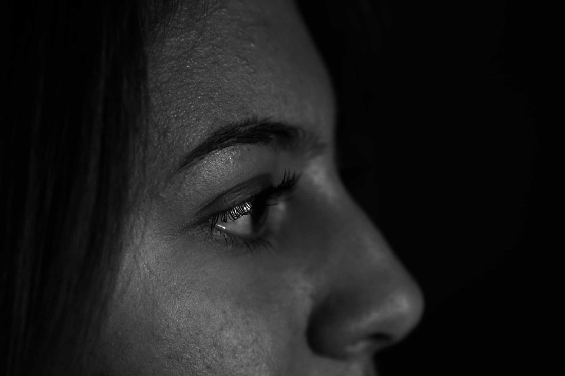
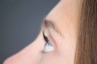
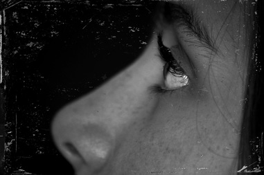
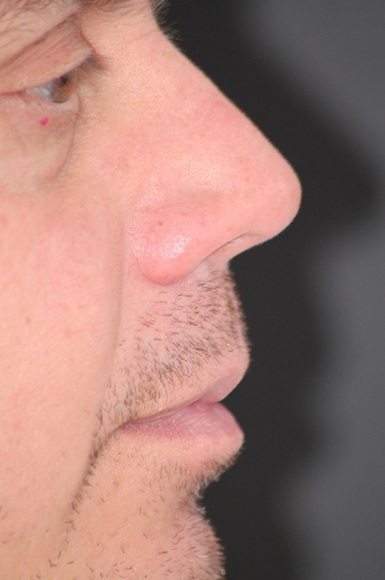
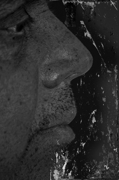
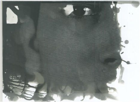
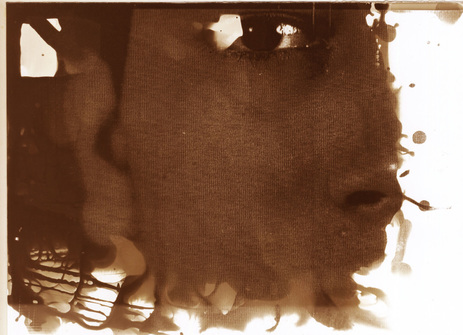
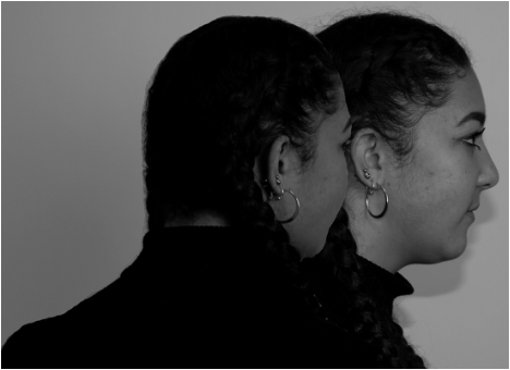
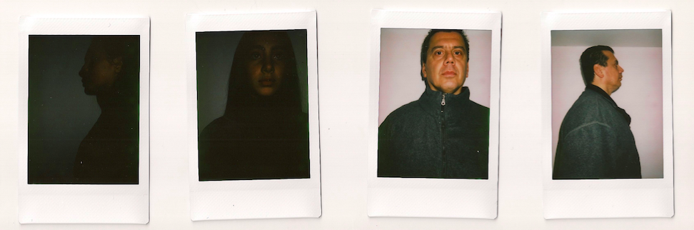
This is Myra Greene's photograph on the left, which shows the profile of her face, her nose and her lips. The photo has a liquid/oily type texture. The photo is in black and white, but has a dark brown colour to it. This is my image on the right, that has some differences and similarities with Myra Greene's photo. The similarities are that the photos are both profile and have a texture look to them. However, the differences are that in my photo, my model's eye are visible. whereas Myra Greene's photo, they are not.

|
|
Darkroom Experiments with Sayako Sugawara
This lesson was with Sayako Sugawara and she demonstrated to us the different ways of exposing an image in the dark room.
One way of exposing an image was to expose it in oil and water. This worked by putting the photographic paper into the oil and water and placing the negative image on a glass panel then covering the negative with another glass panel; then exposing it. However, for the image to have an effect, you must blow the oil around the photographic paper. Another way of exposing an image was by exposing the image normally. Then instead putting the whole image in the developer, you take a paint brush and create strokes to the photographic paper in any way you want and the image with slowly develop due to where you stroke. A third way of exposing an image is by also exposing it normally and then instead of putting the photographic paper in the developer, you spray it with the developer to create a 'dotty' type of effect. A fourth way of exposing an image is by putting tissue paper onto the image and then putting a glass panel over it, then exposing it. This will create a blurry type of effect.
One way of exposing an image was to expose it in oil and water. This worked by putting the photographic paper into the oil and water and placing the negative image on a glass panel then covering the negative with another glass panel; then exposing it. However, for the image to have an effect, you must blow the oil around the photographic paper. Another way of exposing an image was by exposing the image normally. Then instead putting the whole image in the developer, you take a paint brush and create strokes to the photographic paper in any way you want and the image with slowly develop due to where you stroke. A third way of exposing an image is by also exposing it normally and then instead of putting the photographic paper in the developer, you spray it with the developer to create a 'dotty' type of effect. A fourth way of exposing an image is by putting tissue paper onto the image and then putting a glass panel over it, then exposing it. This will create a blurry type of effect.

|
|
My response
test strip
test strip
exposure technique: spray
|
|
exposure technique: tissue paper
|

exposure technique: spray
|
exposure technique: oil and water
|
|
|
I have done two test strips in order to find the exposure type that I wanted. To create a test strip, I took a thin piece of photographic paper and put it on top of my image with a black piece of card paper. Then, I chose different exposure times and covered sections of the photograph. I repeated this technique until the end of the photo. Then I put the photographic paper into the developer until it develops, then into the stop, to the photo stops developing and then into fix which fixes the photograph. Then, I put the photographic paper into water so all the chemicals can wash off. Lastly, I went outside the darkroom and put the photograph into a drying machine and chose the best exposure time to have for all my photographs.
ARTIST AND ME
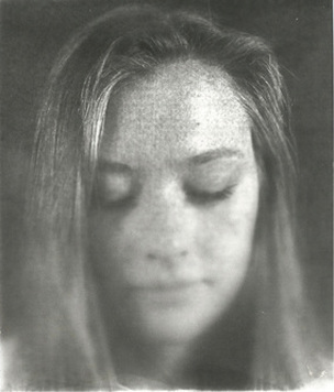
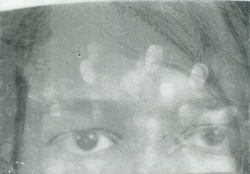
This is the past student's photograph that shows two model's faces in photographic paper. The photograph is in black and white. The student has not put the exposed photographic paper in the developer fully, however, has taken a brush with the developer and brushed over the photographic paper until the faces have been exposed. This is my image on the right, that has some differences and some similarities with the past student's image. For example, the differences are that my image shows my model's nose whereas the student's image shows two full faces. Another difference is that I used the spray and brush technique, whereas the past student used only the brush technique. However, the similarities are that we used very similar techniques to produce our final outcomes.
|
|
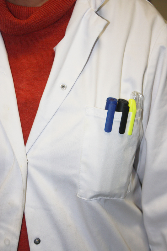
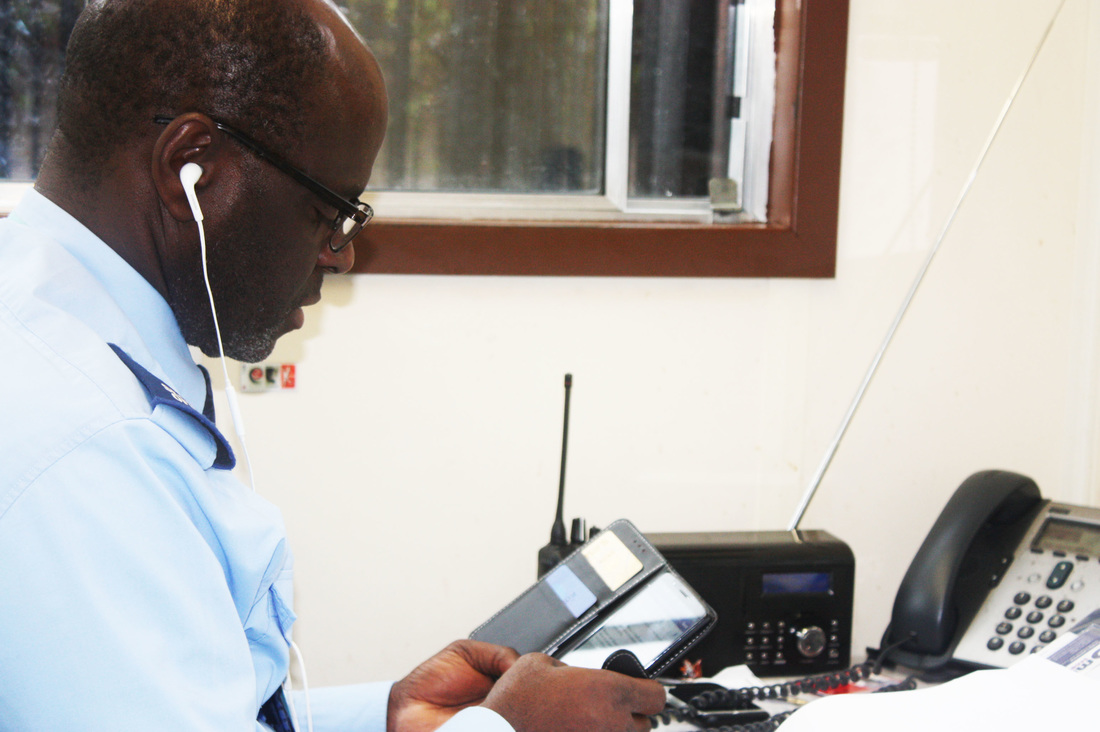
George Town- Lewis Khan
This task's intentions was to document a person's environment and life in response to the photographer Lewis Khan. Lewis Khan is a famous photographer who documents people's life and presents it as a piece of art. His latest piece of work was based on a poor man called George Town. Khan, documented his life, where he goes, what he eats, his personal life and what he thinks about his mum. This type of work is very intimate and invasive, however, this is what Lewis Khan interprets art as.
|
|
|
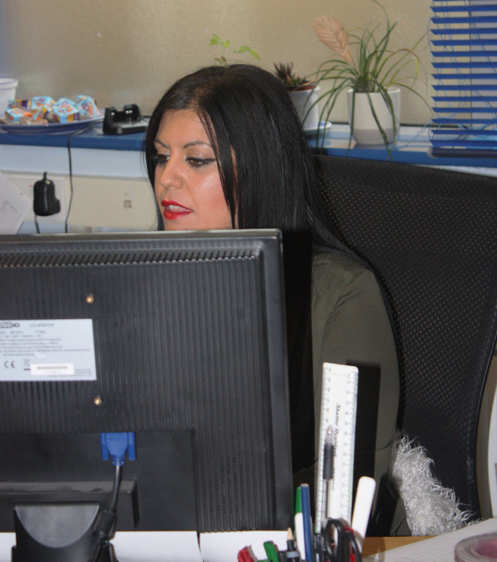
My response was by going around my school and capturing people working and the environment in the rooms. For example, I went to the office and took photographs of the secretaries on the phone and working on their computers, I then went to the science lab and took many photographs of the science equipment that are used, to capture a proper grasp of the feel in the science labs. Lastly, I went to photograph our security guard at the gate to capture the type of things he does in his little cabinet.
Overall, I found this task interesting, because different environments and different jobs have a completely different vibe.
Overall, I found this task interesting, because different environments and different jobs have a completely different vibe.
|
|
|
|
|
|

|
|
|
ARTIST AND ME
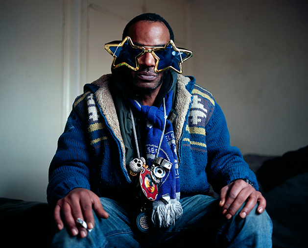
This is Lewis Khan's photograph of George Town. The photograph shows George Town in his natural environment, in his bedroom. He is wearing a woollen blue, yellow, brown and yellow jacket with a Tottenham football scarf, a dark green shirt, jeans and large star sunglasses. In addition, Town is holding a cigarette between his fingers. This is my image on the right, that has some differences and some differences with Lewis Khan's photograph. For example, the similarities are that I'm capturing someone is their natural environment. The differences are that my model is a woman whereas Khan's model is a man. Another difference is the angle that the photograph is taken with. My photograph's image is taken portrait style, whereas Khan's photograph is taken landscape style, additionally, my model isn't facing the camera, but involving herself in her work, whereas George Town is looking into the camera.

|

|
Portraits
For my first strand I have decided to take portraits like the artist Anton Corbijn. Anton Corbijn is a Dutch photographer, a film director and a music video director. He took a lot of photographs of the band Herman Brood & His Wild Romance and these led to a rise in fame for Brood and in exposure for Corbijn. From the late 1970s the London based New Musical Express (NME), a weekly music paper, featured his work on a regular basis and would often have a photograph by him on the front page. Corbijn made his name through photographing in black-and-white but in May 1989 he began taking pictures in colour using filters. His first venture in this medium was for Siouxsie Sioux. Between 1998-2000, in collaboration with the painter Marlene Dumas, he worked on a project called "Stripping Girls", which took the strip clubs and peep shows of Amsterdam as their subject; while Corbijn later exhibited photographs, Dumas took Polaroids which she then used as sources for her paintings.
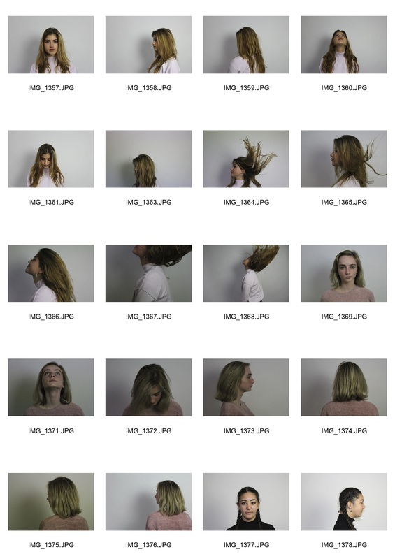
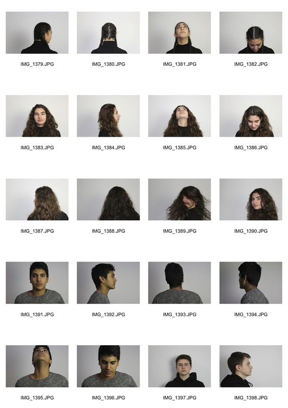
Raw images
|

|
|
|
Equipment: The equipment I used was my Canon Camera, a white background and a strong white light.
Process: The process in creating one of these photographs was purely using photoshop. It took me quite a while to create all six images as the process is quite time-consuming. For example:
Process: The process in creating one of these photographs was purely using photoshop. It took me quite a while to create all six images as the process is quite time-consuming. For example:
- Step one was to choose any of my portraits that I took, having the model facing the camera.
- Step two was to choose another image of the same model but looking another direction, in this case I chose the side-view of the model
- Step three, I cropped the second image to the size I wanted and then copied and pasted it onto the first image.
- Then I rubbed out the excess background from the second image to have the outline of the face and shoulders. This step was the most time-consuming because I wanted to rub out as close to the face as possible to make the final image look really professional.
- Lastly, I positioned the second image wherever I desired and made the image black and white and played around with the levels to make the photograph how I liked.
ARTIST AND ME
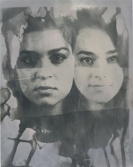
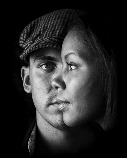
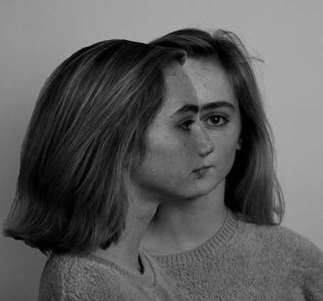
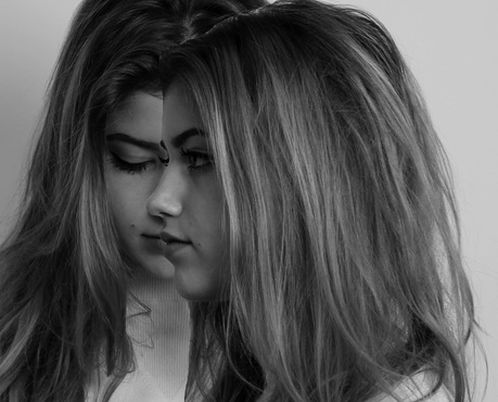
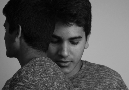
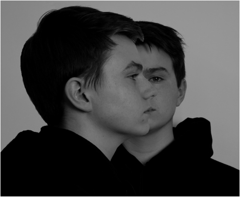
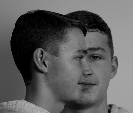
This is Anton Corbijn's photograph which shows a male and female looking opposite directions, but their faces are really close to one another. This creates an illusion to some extent which is that the female's eye and nose replaces the males. The image is in black and white. The man is wearing a hat and a black and white shirt.The photograph is cropped to their necks. This is my image that has some differences and similarities with Corbijn's photo. For example, one difference is that my image shows the same person twice, whereas the artist's image shows two different people. I have done it this way because I wanted to highlight the fact one person can see life in different perspectives. Another difference is that my photo has a lighter black and white tint, whereas Anton Corbijn's black and white is very vivid and strong. Lastly, my model is not wearing a hat and is not wearing a black and white shirt, but is wearing a grey hoodie.

|
|
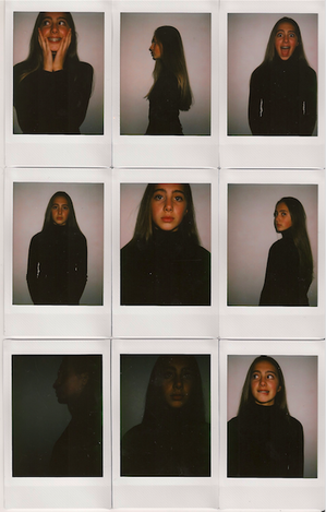
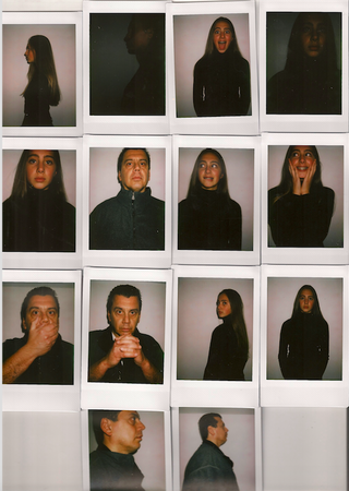
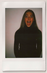
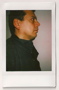
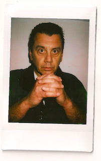
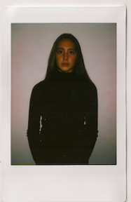
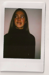
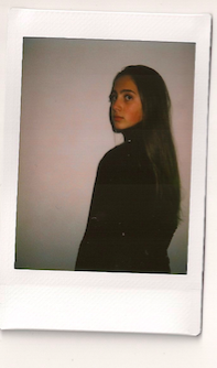
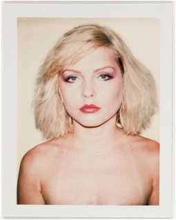
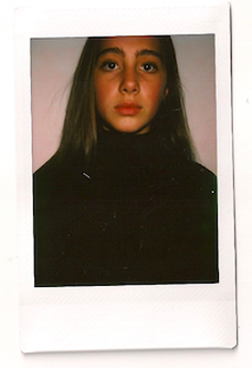
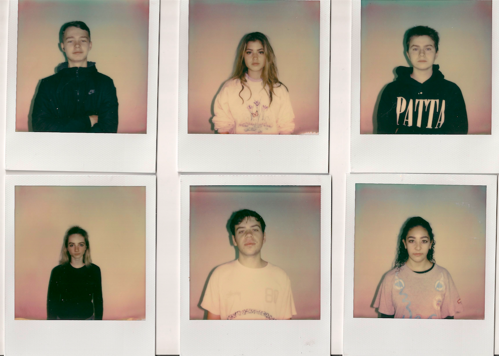
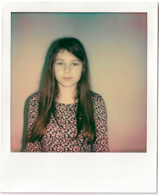
Polaroids
For my second strand I have decided to capture portraits with my polaroid camera. This is because I want to create a more stable, structured and vintage concept. This strand is inspired by the photographer Andy Warhol. In the late 1950s, Warhol began devoting more attention to painting, and in 1961, he debuted the concept of "pop art"—paintings that focused on mass-produced commercial goods. In 1962, he exhibited the now-iconic paintings of Campbell's soup cans. These small canvas works of everyday consumer products created a major stir in the art world, bringing both Warhol and pop art into the national spotlight for the first time. Warhol's other famous pop paintings depicted Coca-cola bottles, vacuum cleaners and hamburgers. He also painted celebrity portraits in vivid and garish colors; his most famous subjects include Marilyn Monroe, Elizabeth Taylor, Mick Jagger and Mao Zedong. As these portraits gained fame and notoriety, Warhol began to receive hundreds of commissions for portraits from socialites and celebrities. His portrait "Eight Elvises" eventually resold for $100 million in 2008, making it one of the most valuable paintings in world history.
|
|
|
Raw images
|
|
Final images
|
|

|
|
|
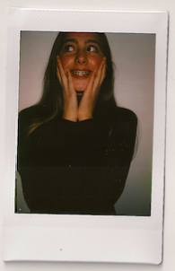
Equipment: Using my 300 Polaroid camera and a white wall.
Process: I asked my two models to stand infront of my white wall because it's very plain and empty in order for picture to have no distractions, so the viewer can focus on the model. I instructed the model how to pose for the picture. For example, I asked them to be serious, scared, shocked, happy and satisfied, this is because I wanted to explore different facial expressions in order to make the photos interesting and have a variety.
Analysis: I feel like I have achieved my aim completely. This is because I am very happy with my outcomes, I have given myself a lot of time to complete this therefore, I was calm and took my time in order to produce my work at my best ability possible. Moreover, I am very pleased with my outcome because I am satisfied with the lighting, angles, face expressions and the closeness of the polaroid camera. I especially like how the lighting in the photo in certain areas gives a highlighting effect, as it brings a sense of 3D.
Images that went wrong
Problem 1: These are my four images that went wrong as I am not very pleased with them. For example, the first two polaroids, I shot them with the camera setting 'inside/dark' because I was in my room shooting. As a result, my two images developed as being very dark for my liking.
Solution: Therefore, I changed the setting to 'cloudy', as a result of this setting, the lighting came out perfectly (as shown with the photos on the right).
Problem 2: My second problem was in my two photos on the right, the angle was not right as it didn't compliment the model's body.
Solution: Therefore, I played around with different angles looking through the camera hole and when I found the perfect angle, I shot the picture.
ARTIST AND ME
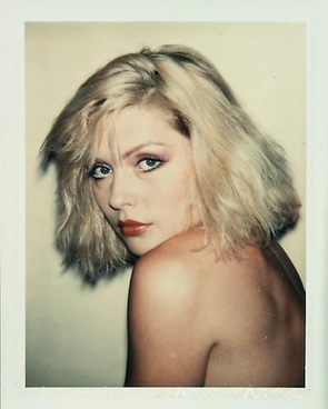
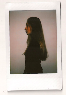
This is Andy Warhol's polaroid photo. It shows a nude woman from the chest above, she is looking at the camera with a serious face. She is wearing red lipstick, pink eyeshadow and eyeliner. She has blonde short hair. The lighting in the picture is bright as the backgound is white, her skin colour is white and hr hair is blonde. This is my polaroid photo that has some similarities and differences with Andy Warhol's picture. The differences are that my picture has a slightly different angle. For example, my image captures more of my model's body compared the Warhol's model. In addition, the other difference is that my model is wearing black and has a darker tone to her skin, whereas Warhol's model has a more fair tone to her skin that is more lighter. Another difference is that my model's head is slightly cut off whereas Warhol model's isn't. However, the similarities are that the models are females and looking at the camera with a serious face.
|
|
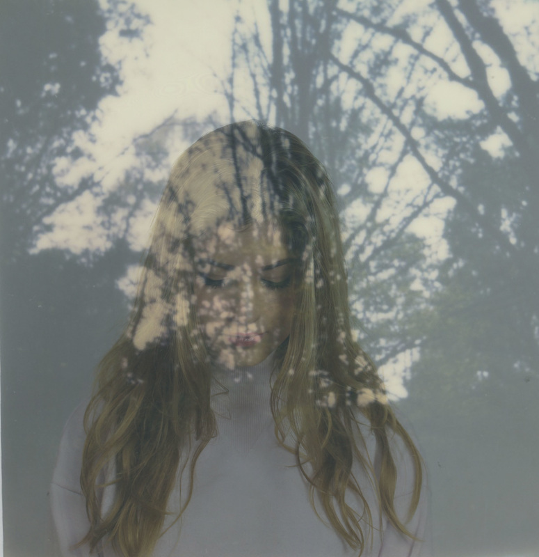
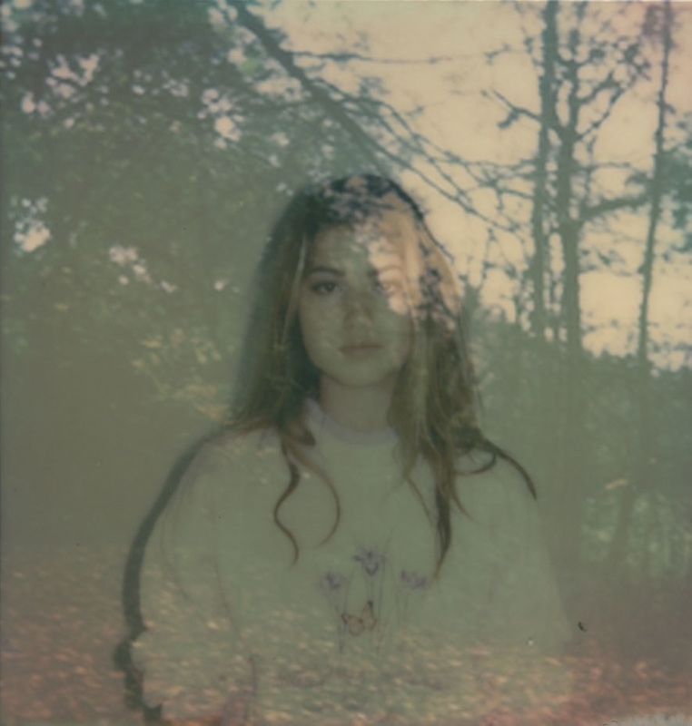
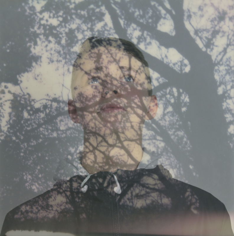
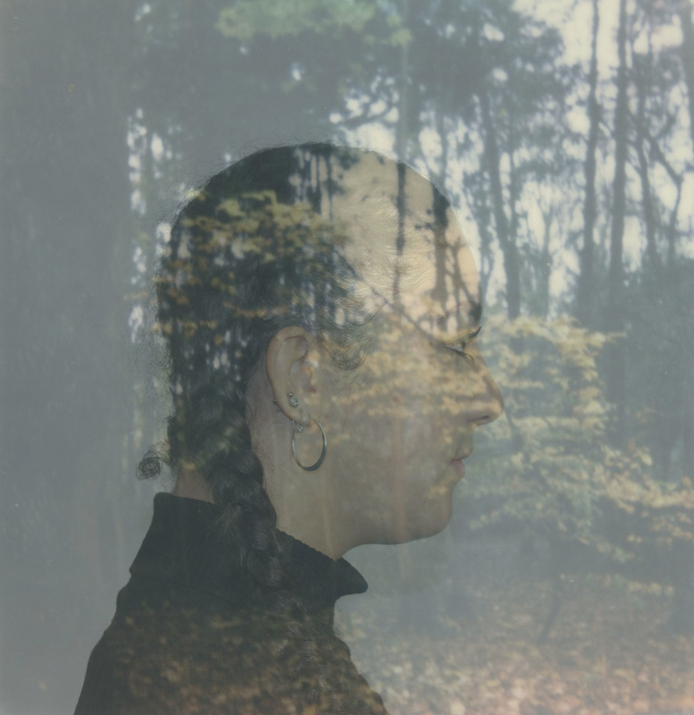
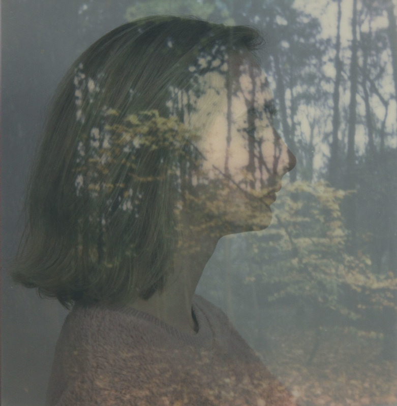
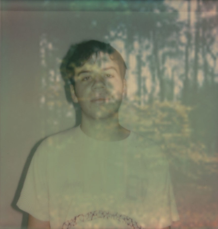
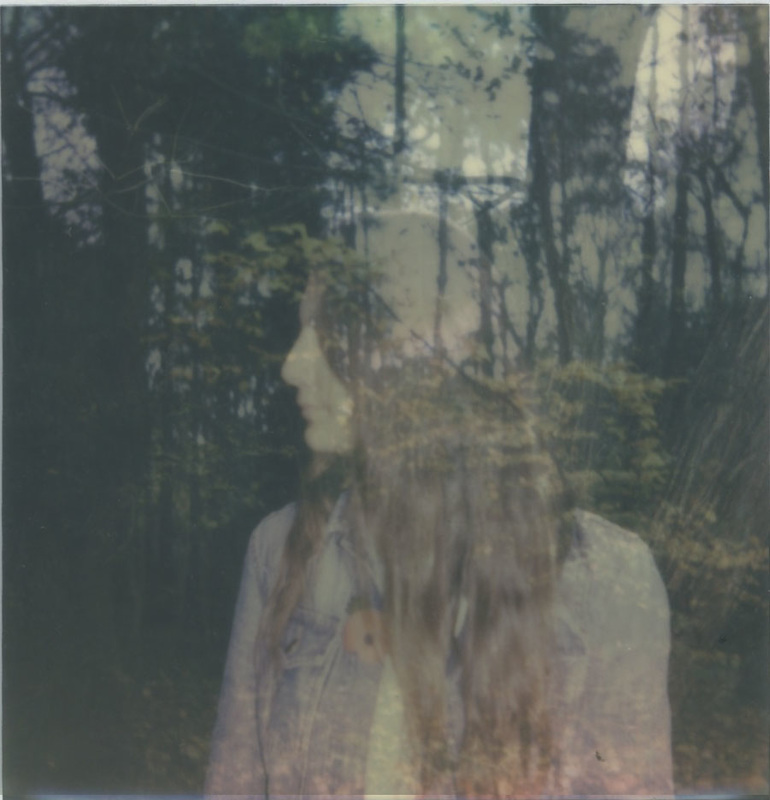
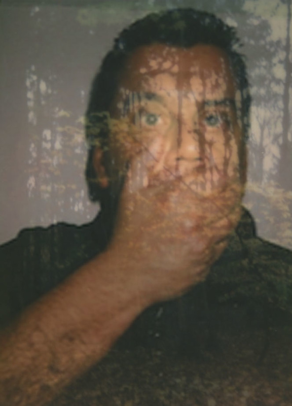
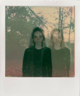
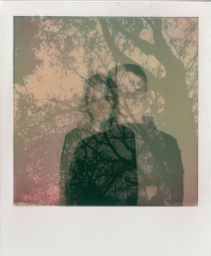
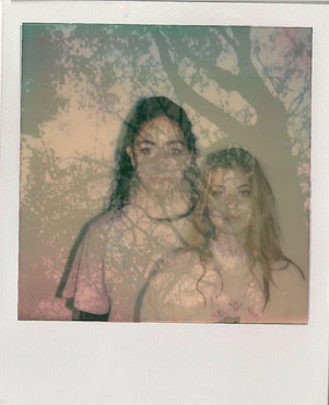
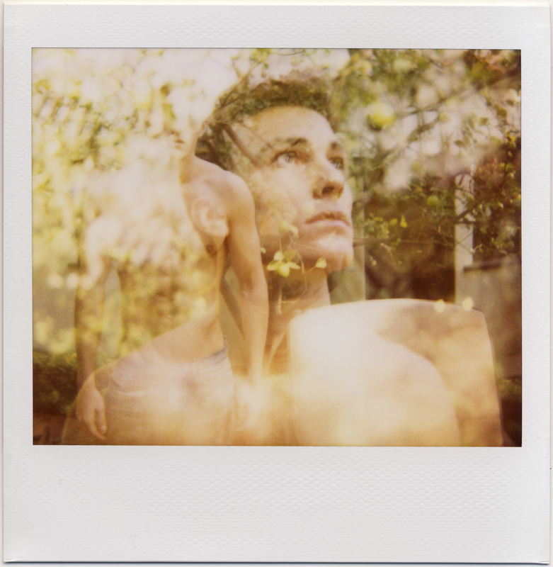
Double Exposure
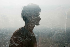
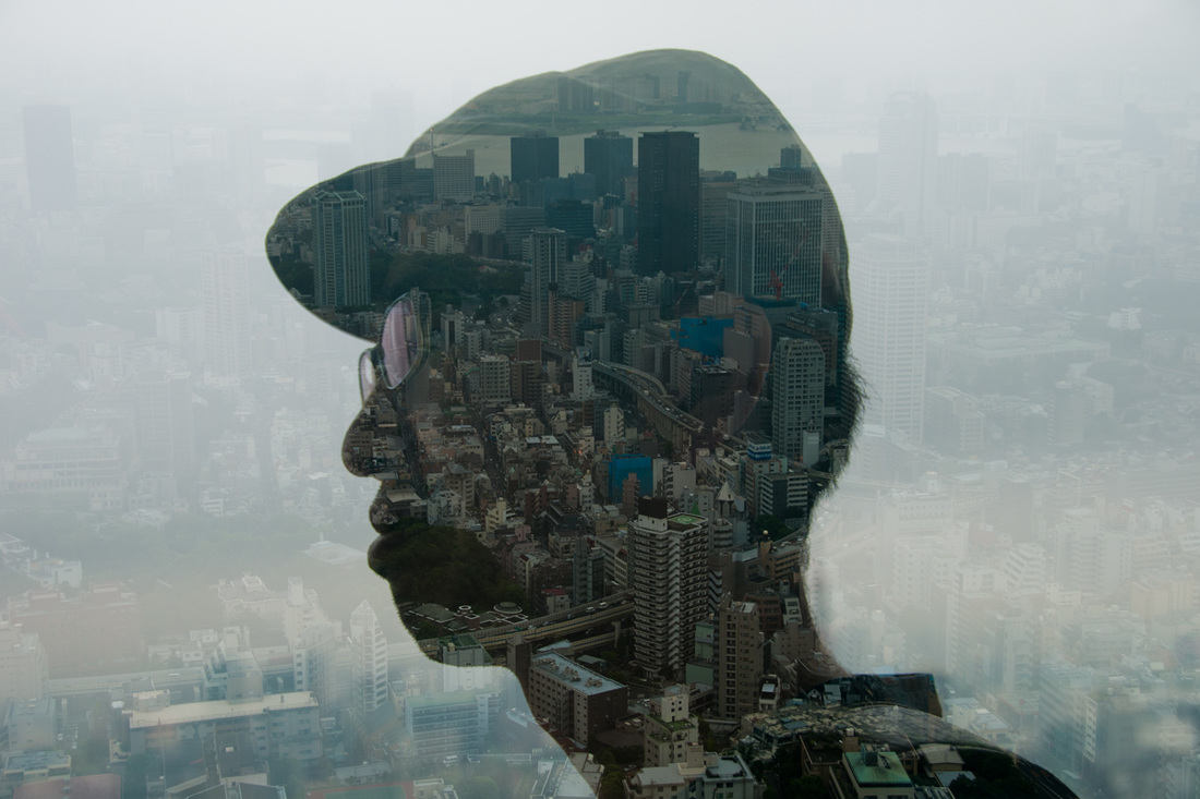
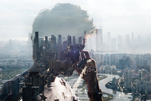
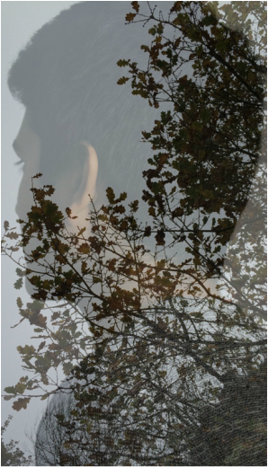
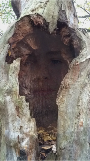
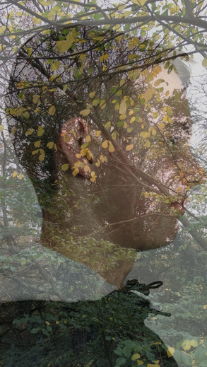
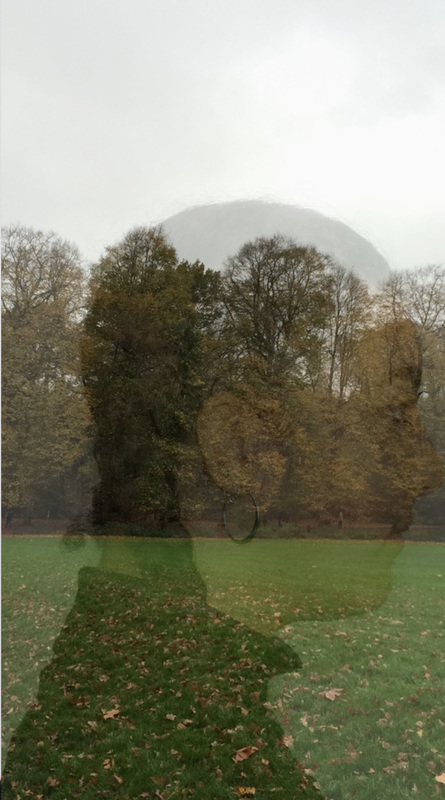
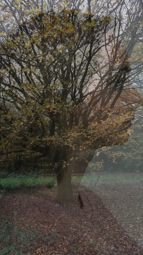
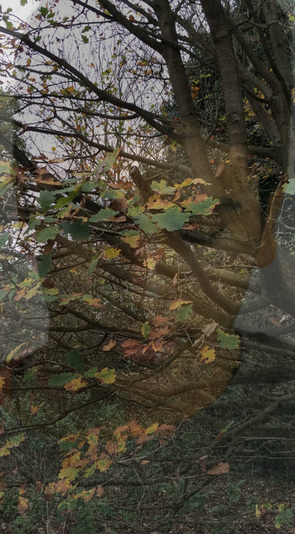
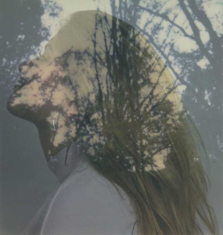
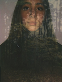
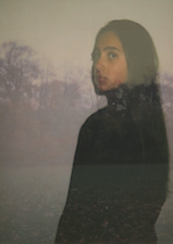
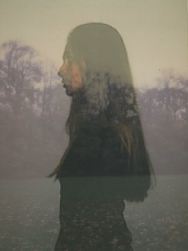
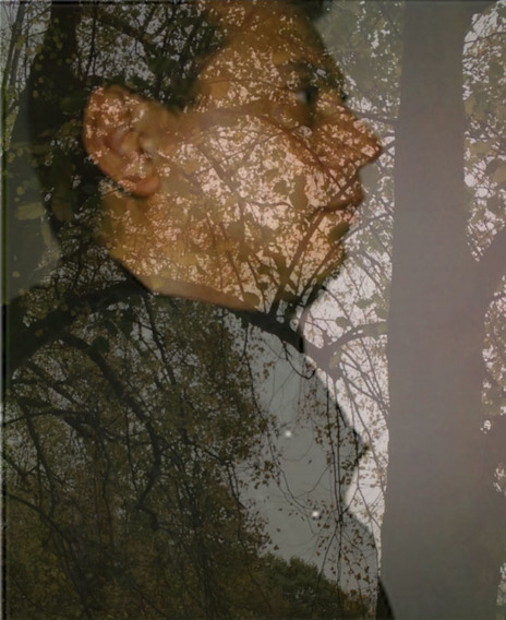
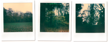
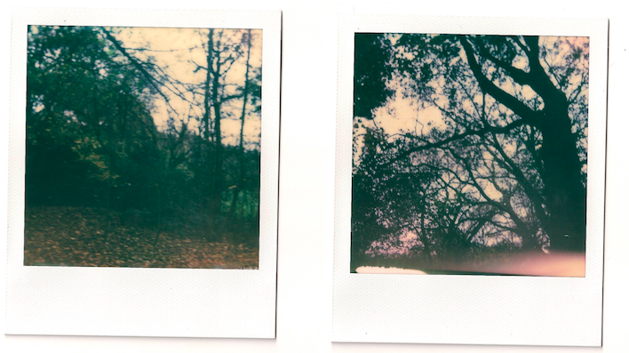
For my third strand I am going to combine the ideas of portraits and the idea of documenting someone's day. Therefore, I have decided to take pictures of the daytime and combine that with a portrait. As a result, I will be creating a layering effect. This idea is inspired by the photographer Jasper James. Jasper James is a Chinese photographer who currently lives and works in Beijing and Shanghai. He has worked with various companies such as Ferrari, British Airways and Wrigles. The project that he did and that inspired me is called 'City Silhouettes'. In his project he layered a portrait (silhouette) with a city picture.
|
|
|
Raw images
|
|
|
|
|
|
|
|
|
|
|
|
|
|
|
|
|
|
|
|
|
What went well: I like how some of my images came out nicely, for example the first, third and seventh because the portrait really blends nicely into the nature photographs.
Even better if: To improve these set of images I would make sure to not simply add one image on another because that doesn't create any effect.
Even better if: To improve these set of images I would make sure to not simply add one image on another because that doesn't create any effect.
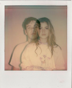
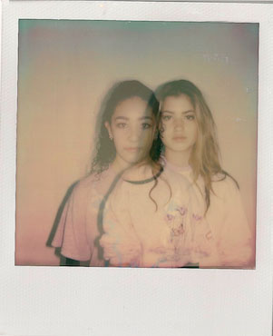
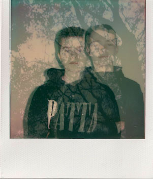
Polaroid Double Exposoure
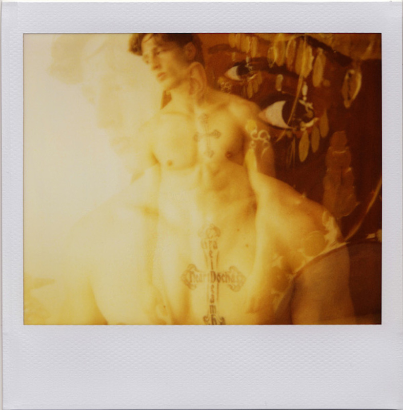
For my fourth strand I have decided to do the same idea as my third strand, double exposure of nature (instead of the city) and portraits. However, I won't take the photos with my Canon camera, I will take the pictures on my new Polaroid Camera 600. This is because my Polaroid 300 Camera, its film is too small and I wanted a bigger film.
An artist who has inspired me is Jeremy Kost; Jeremy Kost is a tireless chronicler of gender, sexuality, and nightlifer. He captures images, of male models in the Californian desert or drag queens strutting through Pittsburgh. Strongly influenced by Warhol, both in his choice of subjects and technique. Kost extends the creative potential of some of Warhol’s favourite tools – the Polaroid camera, silkscreen processes, and more.
An artist who has inspired me is Jeremy Kost; Jeremy Kost is a tireless chronicler of gender, sexuality, and nightlifer. He captures images, of male models in the Californian desert or drag queens strutting through Pittsburgh. Strongly influenced by Warhol, both in his choice of subjects and technique. Kost extends the creative potential of some of Warhol’s favourite tools – the Polaroid camera, silkscreen processes, and more.
|

|
|
Using my double Polaroid One600 camera to try to create a double exposure, the results were not good at all because my specific Polaroid Camera doesn't allow me to create a double exposure.
Raw Images
|
|
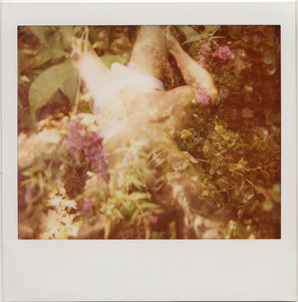
However, I will still take double exposure polaroids portraits separately and merge the landscape photo on top of each other. This is because I believe this is the best way to achieve what I want and still relate my images to Jeremy Kost.
|
|
|
|
|
|
What went well: I like how the double and triple exposure came out and the polaroid colours, because it gives the photographs a more interesting look.
Even better if: To improve the photographs, I would perhaps take the portraits outside with the nature, to make it more like Jeremy Kost's images.
Even better if: To improve the photographs, I would perhaps take the portraits outside with the nature, to make it more like Jeremy Kost's images.
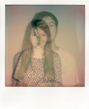
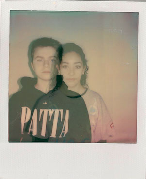
ARTIST & ME
The image on the left is Jeremy Kost's and the image on the right is mine. There are some differences and some similarities between them; for example, the similarities are that both out photographs have triple exposure with two portraits of people. However, the differences are that my photograph has two portraits of different people, whereas Kost's photograph has two portraits of the same person. Another difference are the colours of the polaroid, for example, my photograph has more pinky and purply colours, whereas Kost's photograph has yellowy and green colours.
|

|
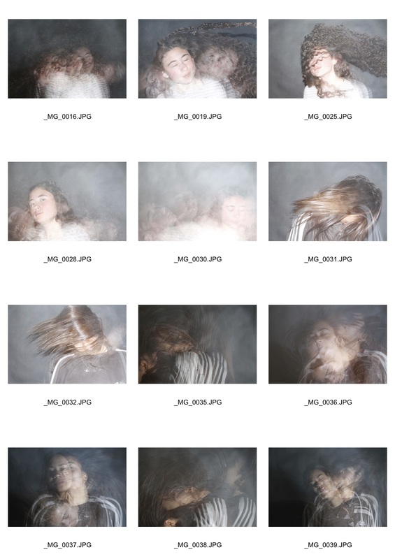
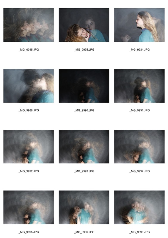
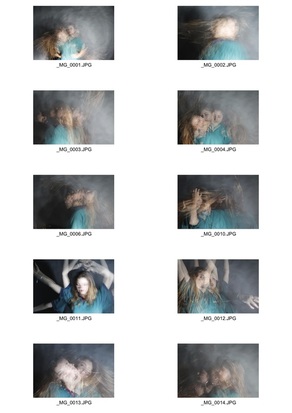
STROBE LIGHT
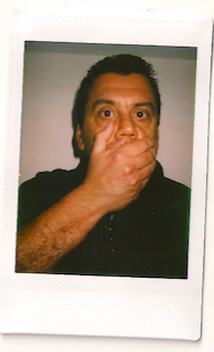
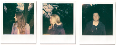
For my final development, I have decided to capture a new set of portraits with movement using a strobe light, for example, capture a hair flip. I really like this idea because it's visually appealing, eye-catching and fun. In creating these images, I had my camera setting on BULB and F stop on 7. However, I didn't turn off my flash because the flash was what created the good focus.
Raw Images
|
|
|
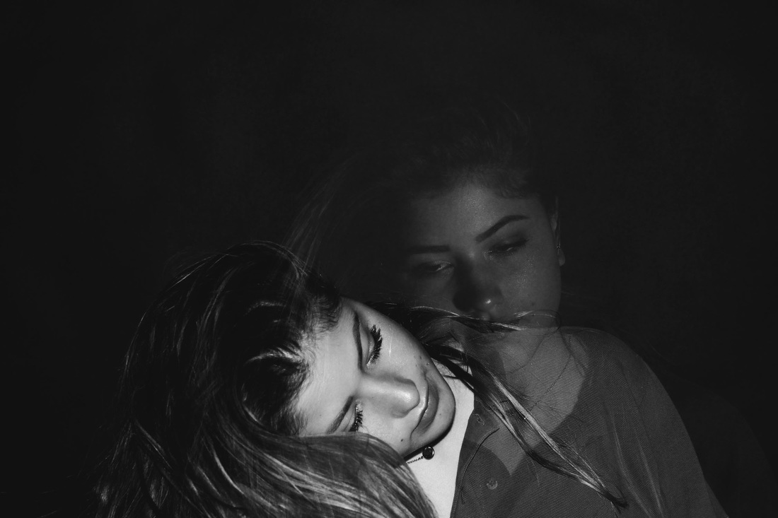
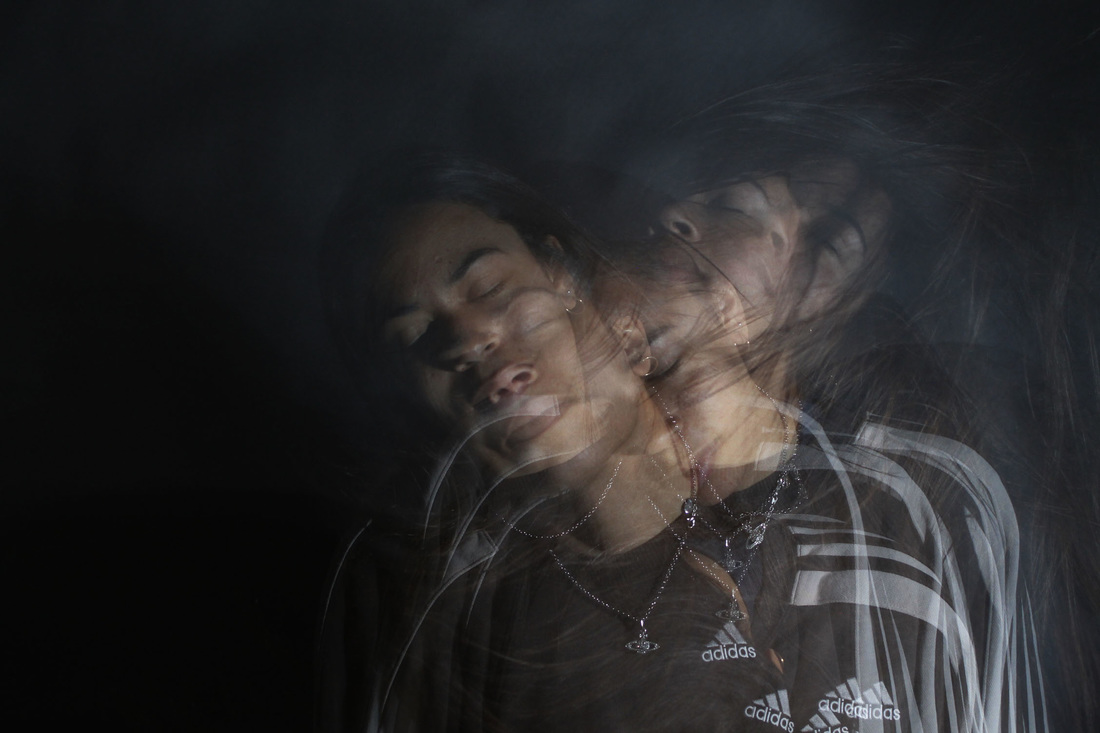
Edited photographs
Final Photographs
Overall, I have deeply enjoyed this portraiture project because I was able to be creative and develop my own interpretations of a portrait, with a bit of help from famous photographers. I believe that I have worked at my very best with this project in order to show my passion for photography and especially portraiture.
